The Paloma brand
One identity across Paloma Planning Studio, Paloma Production, and every table we set. Screenshot-worthy on purpose.
The mark
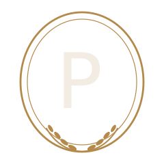
An italic "P" held in a fine brass laurel oval. It reads as a maker's stamp: quietly expensive, and it lives everywhere from a favicon to a wax seal on a real invitation.
Primary mark
- Give it room to breathe (clear space = the height of the "P").
- Use the mark alone once the brand is known; use mark + wordmark to introduce it.
- Recolor the oval anything but brass, ink, or bone.
- Stretch, rotate, or add a drop shadow.
Palette
Ivory and tonal, so the food, flowers, and rooms are the color, with one dramatic black moment for the hero. Dusty blue is the one confident accent; brass is for fine lines and detail.
Typography
Two voices and a whisper: a characterful italic serif for moments, a clean sans for everything you read, and tracked capitals for the fine print on menus and place cards.
Chic private dinner parties in New York, and the weekends and celebrations that deserve the same care. Clear, warm, and easy to read on a phone.
Menu · Seating · With love, Paloma
Art direction
This is the engine. You do not have photos yet, so decide the look now: then every real dinner you shoot stacks into one recognizable world. Warm, candlelit, and intimate: real moments over stiff staging.
The look
Natural and candlelit, never flash. A touch of film grain and warmth. Muted tones that sit inside the palette. Lots of negative space. Hands, pours, and close details as much as the wide table. Shoot vertical for phones.
The grid
Alternate wide tablescapes, tight details, and the occasional type-only tile (a quote or the mark) so the feed has rhythm.
Shot list for every dinner
- Overhead of the full table, before guests
- One place setting, close
- The menu or place card in hand
- A pour (wine, spritz, water into glass)
- Florals detail
- Candles lit, low light
- Hands passing a dish
- The room, wide, once it is full
- A dessert or cake moment
- The host laughing, unposed
Voice
Warm, confident, a little playful. Talks like a stylish friend who happens to be very good at this, never like a corporate caterer. Plain words, real specifics, no jargon.
"Tell us what you are dreaming up. We will handle the rest."
"Nothing charged until you approve."
"A Riviera dinner for ten, lemons and linen included."
"Submit your event requirements below."
"Our premium packages deliver best-in-class solutions."
"Elevate your next occasion with bespoke synergy."
The name system
Paloma is the master brand. Two ways in sit under it, named as a matched pair so the offer is obvious.
Paloma Planning Studio
The self-serve AI. Pull inspiration, pick a style, and it builds your plan. Free to start, host it yourself.
Paloma Production
The done-for-you arm in New York: styling, or full production. We design and run it, you enjoy your own party.
Touchpoints
Where the brand shows up. Consistency here is what makes Paloma feel real and repeatable.
Warm, candlelit grid with rhythm (wide, detail, type). Bio in the brand voice. Highlights per style.
The invitation
Bone card, italic display, brass hairline frame, the monogram as a wax seal or stamp at the base.
Menu & place cards
Tracked capitals for names and courses, the mark small and centered. The detail that guests photograph.
Packaging & thank-you
Brass on bone, monogram seal, a short handwritten-feel note in the voice. Every send-off on brand.